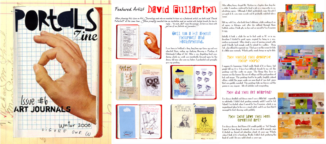
I've been making my my dubious presence felt in a few otherwise worthwhile publications recently. First up is Issue 2 of InPrint magazine, who's theme is 'typography'. Aside from the fact that I have a bunch of stuff in it, it's well worth checking out if you're interested in typography and design. It's also available as free PDF download, so you really have no excuse not to, other than your understandable apathy.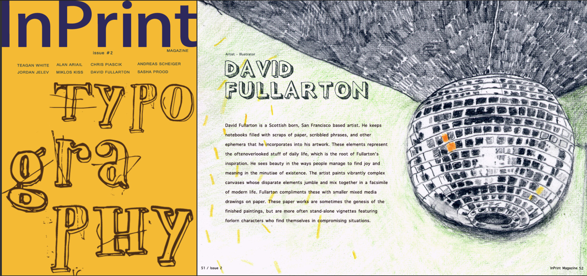 The next publication is Portals Zine - the lavishly produced, 44 page, saddle-stiched 'Art Journals' issue to be specific. You'll have to pay for this one I'm afraid, but needless to say it's well worth every penny of the $20 in question, featuring as it does the only four page, full-color interview with Yours Truly in existence. Want to know what inspires me, or where I create? Then choke up the twenty bucks right here, my friend. You won't be disappointed. Well, you may be, but please don't complain to me if you are. I got no money for this and did my best to appear at least partially interesting.
 Now let us continue our jaunty amble through this leafy literate alleyway until we alight upon the estimable Rückenkälte zine. This, as the teutonic title would suggest, is a Germanic publication. It features both short-stories (mostly in German, nor surprisingly) and, for the amusement of non-German speakers, illustrations. Apparently artists such as Mariana Abasolo, Mitch Blunt and David Shrigley have contributed to past issues (although out of that trio Shrigley is the only one I've actually heard of). The theme of the issue I contributed to is "forms" which, as you can see, I interpreted as obtusely as possible.
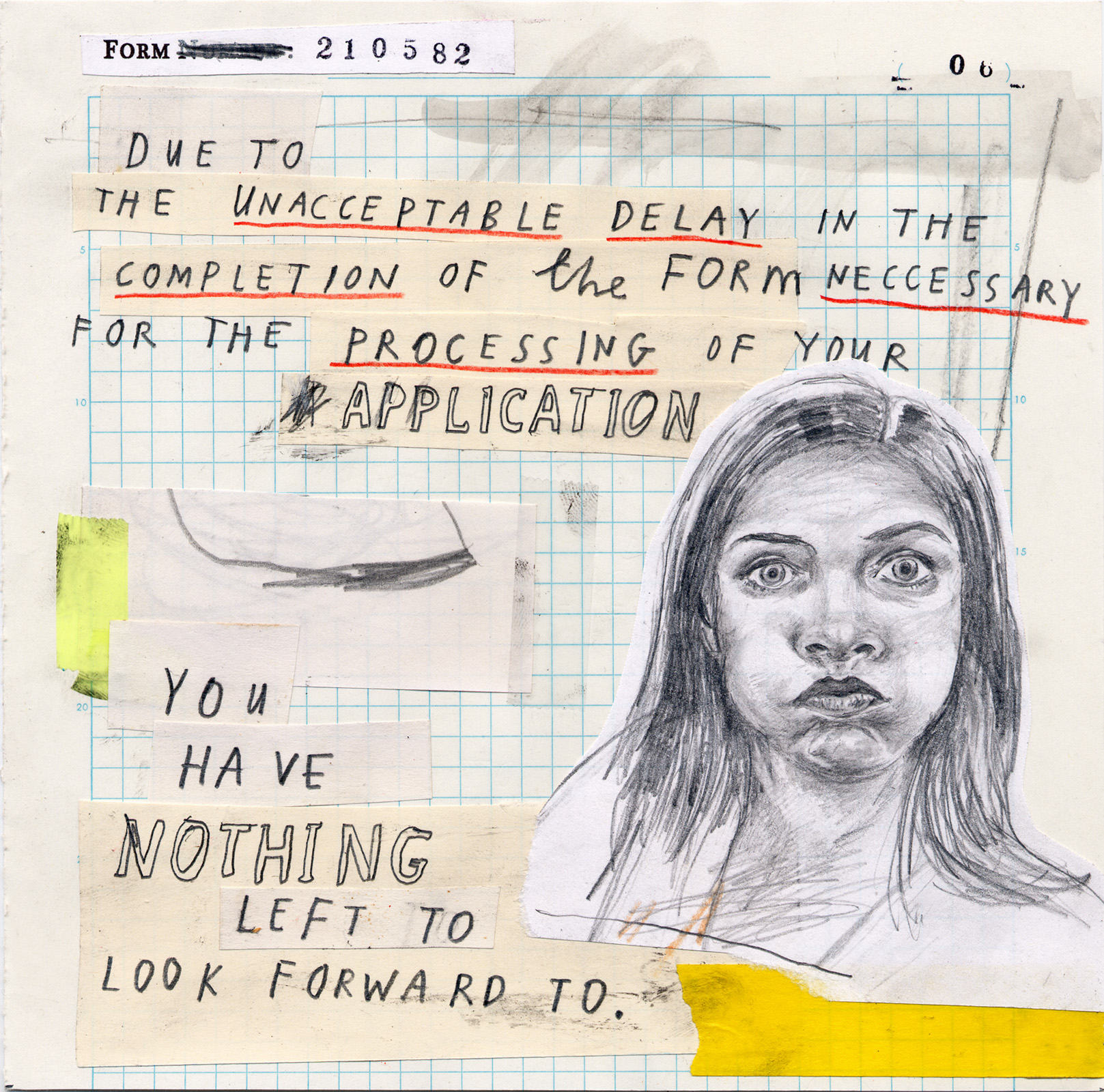 Anyways the good news (or gute nachrichten) for you is that Rückenkälte is a free zine. The bad news (or schlechte nachrichten) for me is that instead of getting paid for my artistic efforts I received a vague and fairly unconvincing promise of "immense popularity among Germans (and Austrians) for your work". We shall see. We shall see.
Disaster movies and shameless celebrity namedropping.
If there was such a thing as a regular reader of this blog, he or she would know I'm not averse to dropping the occasional celebrity name here and there in a transparently pathetic attempt to vicariously associate myself with their fame and glamour. Well you'll be delighted to hear that this is exactly what I'm about to do now. Only more so.The half-baked excuse on this occasion is the appearance of two of my paintings in the soon-to-be completed new Hollywood Blockbuster Disaster Movie from director Steven Soderbergh entitled Contagion.Here's one of the paintings right here: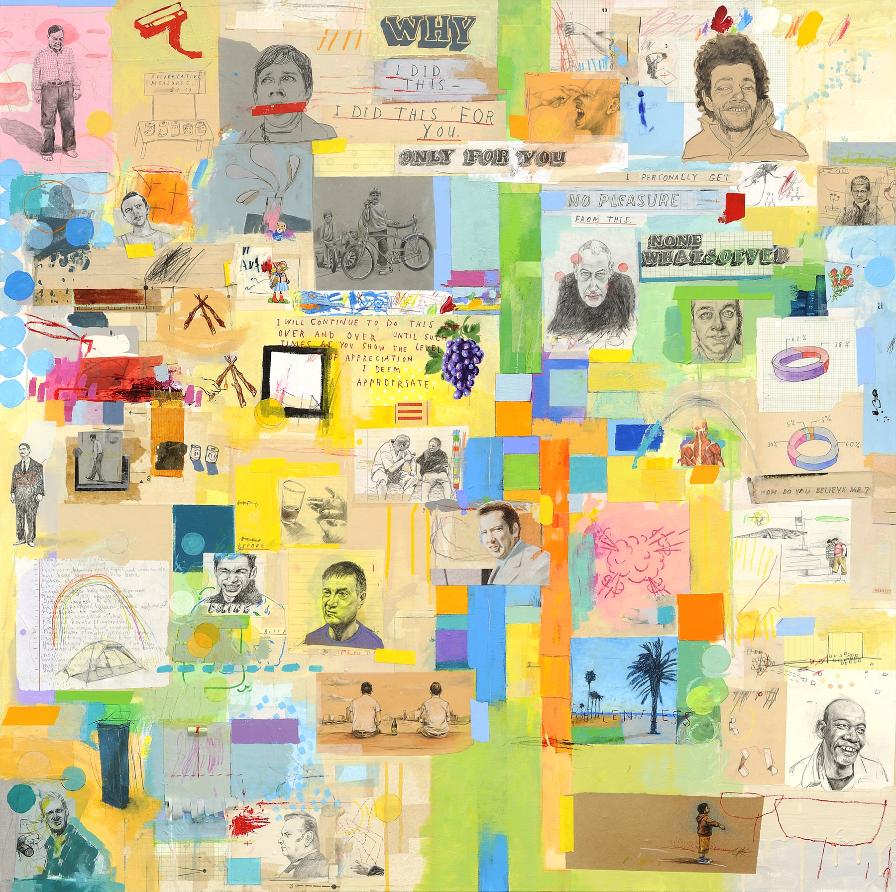 Apart from my paintings the movie also features a host of lesser known stars, such as Jude Law, Matt Damon, Kate Winslet, Gwyneth Paltrow and Laurence Fishburne. You have to admit that's an impressive amount of namedropping - and we're not done yet, there'll be more later. But back to the movie who's plot revolves around "a lethal airborne virus emanating from Asia that responds to no known protocol, is more contagious than the common cold, and kills within days. With the world-wide medical community racing to find a vaccination, society begins to break down as rumor and innuendo swirl across international boundaries". Could be good, could be rubbish. All we know for sure is that the sequence shot in San Francisco may fleetingly feature two paintings that are breathtakingly fantastic, unless they end up on the cutting room floor of course, which is highly likely. Personally I've had a soft-spot for disaster movies, ever since I saw Earthquake in Sensurround at the Edinburgh Odeon, as an undernourished and pimply youth, back in 1974. Richard Roundtree, Walter Matthau, Victoria Principal, Charlton Heston, Ava Gardner now that's a cast worth namedropping!You'll no doubt be wanting to see the other painting, so here it is:
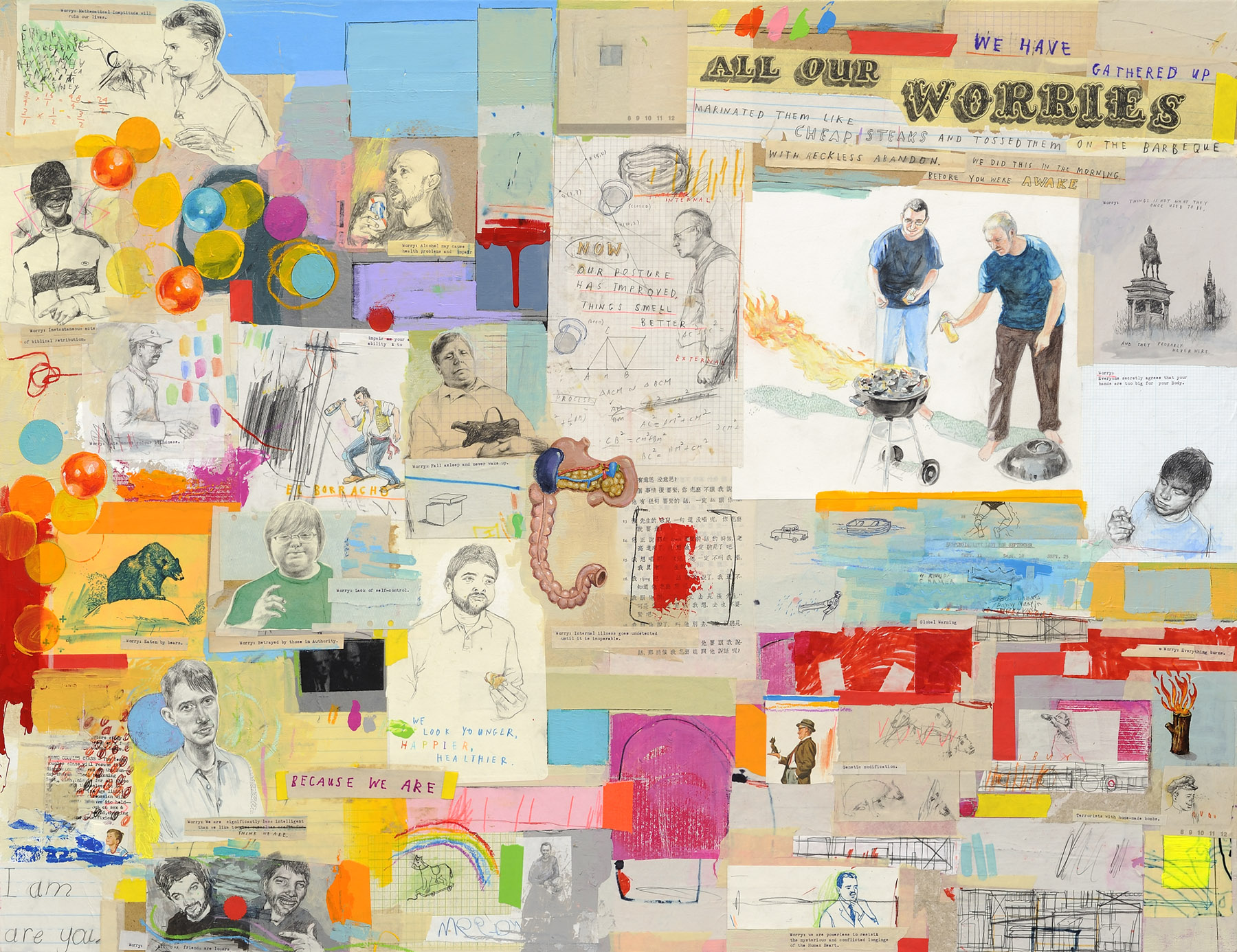 Apparently they'll be lurking in the background during a cafe scene. Oh, and if I may take the liberty of answering the question that I know hovers on everyone's lips, yes, they are both still for sale! This could be your opportunity to own a piece of genuine Hollywood Blockbuster Memorabilia at a very attractive price, an heirloom for future generations to gaze upon in wonder.If you do choose to purchase one of these unique and remarkable pieces you'll be following in the esteemed footsteps of other name-droppable Hollywood Celebrities Robert Downey Jr. and Carrie Fisher, both of whom are proud owners of Fullarton originals. No I'm not kidding. Cross my heart and hope to die. In fact not only does Mr. Downey Jr. own a drawing, which I fondly imagine him gazing at from his favorite armchair as he relaxes in front of a roaring fire with a mug of steaming Ovaltine, this Christmas he actually bought two more pieces to give as gifts to people he particularly despises.And because I know you're fascinated, here's one of the pictures Carrie Fisher bought:
 You can see what she saw in it, can't you?
Fit To Print.
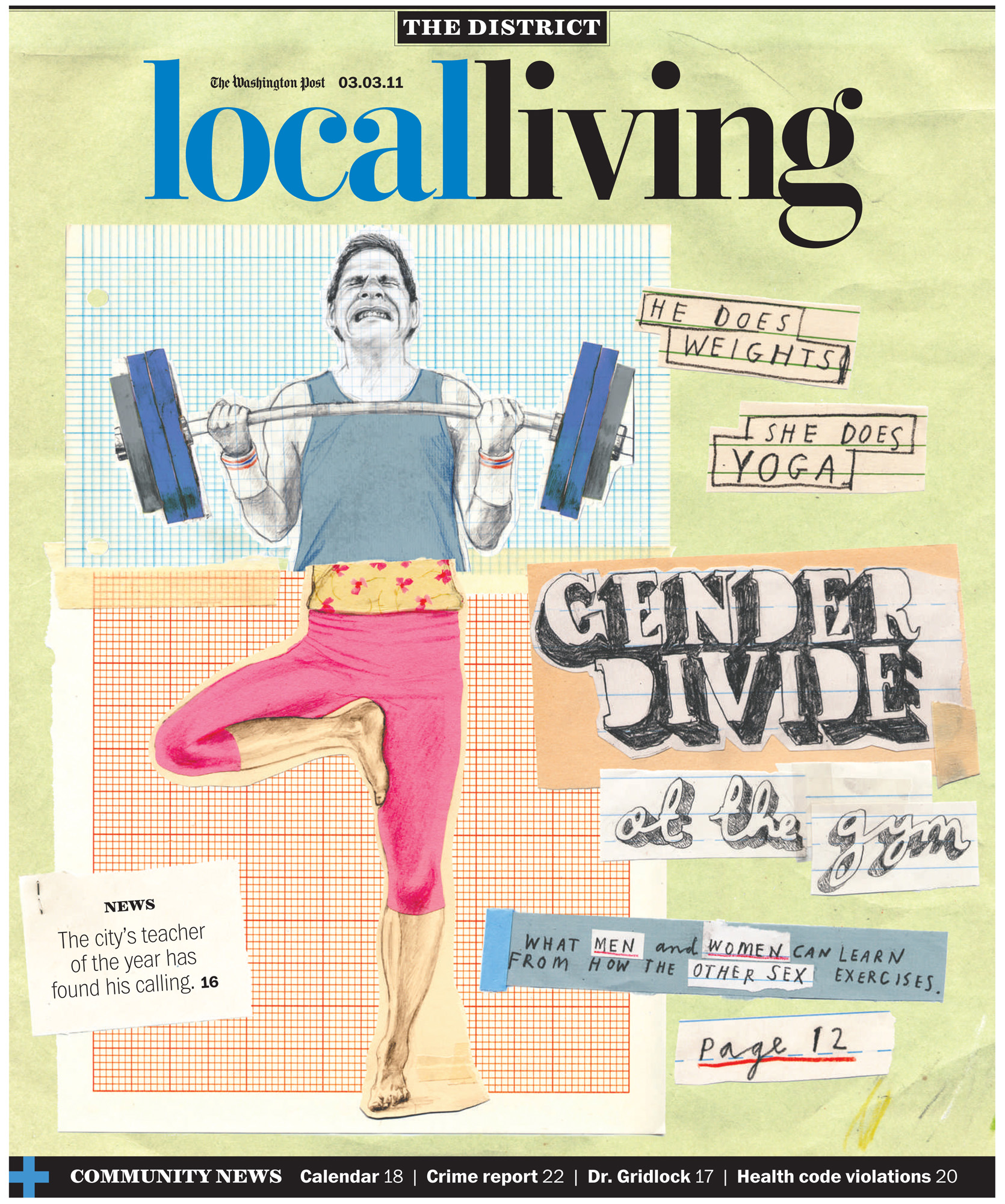
Two posts in two days! Well, don't say I didn't warn you. The last 48 hours has seen a virtual torrent of online activity unleashed. I've even been tweeting and I uploaded a whole butt-load of last year's drawings and paintings to my Behance page. Soon you'll look back longingly on the days when I would go for weeks, nay months, without a digital utterance.Anyhow, the purpose of this particular rambling update is to vaingloriously brag about a recent illustration commission for the Washington Post. The cover of the Local Living section no less.
The article I was asked to illustrate was about the big differences in the way that men and women exercise - men going berserk lifting weights, generally overdoing it and injuring themselves, and women doing stuff like yoga and pilates and taking it too easy to actually get much benefit. As well as the cover there was an inside illustration that appeared alongside the article. I thought the humor would come from contrasting the two approaches side by side - so my challenge was to work out a way to do that in both pieces, and tie them together as well. The result was this approach, kind of based on an exquisite corpse drawing, where the picture of the man and the picture of the woman were 'torn' in half and reassembled as one figure, comparing the characteristics of both to comic effect.
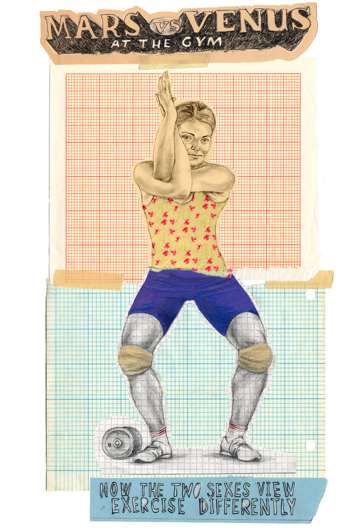
As you can no doubt tell I was responsible for hand drawing most of the type too. It was quite a work out.
What the hell happened to 2011?
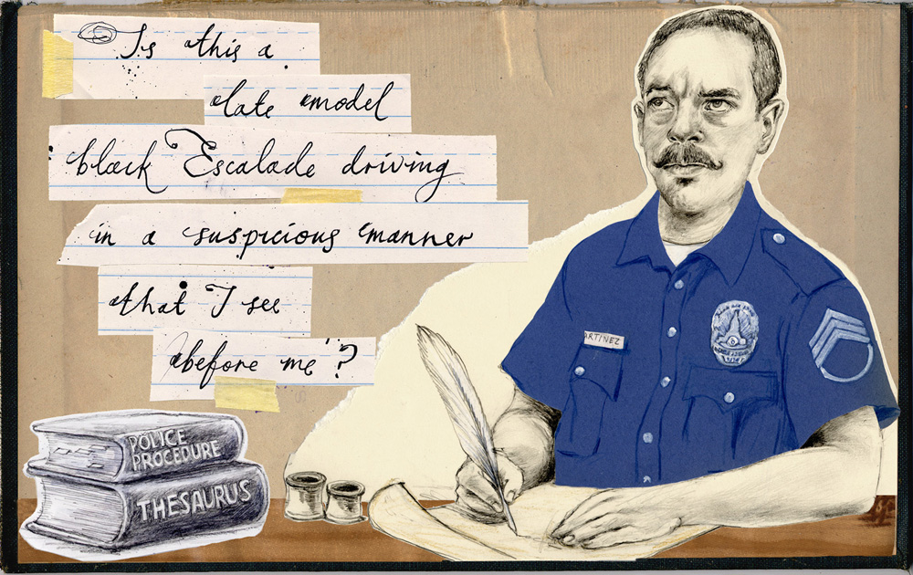
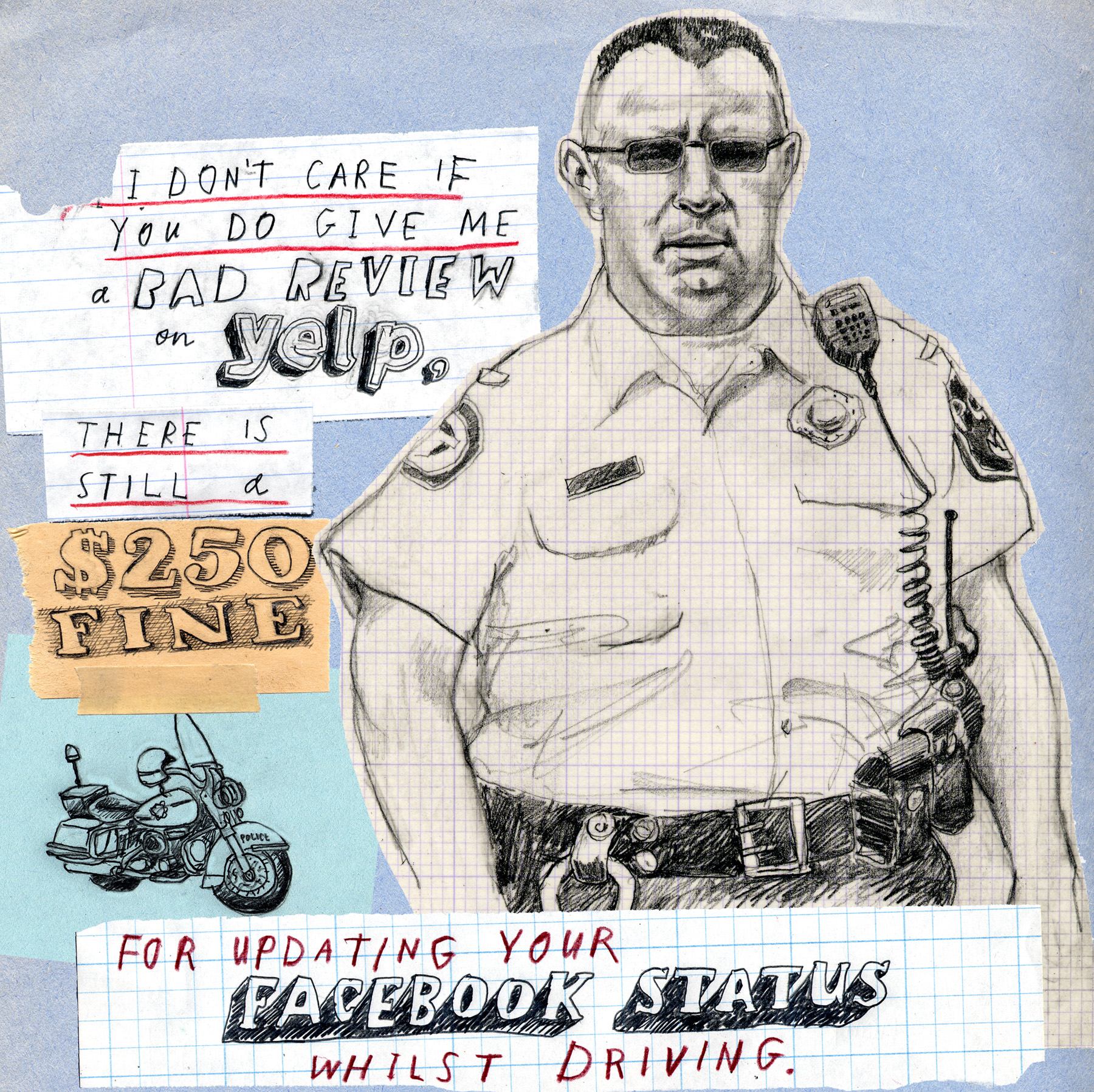
So we're officially halfway through March 2011 and I have yet to muster a single post. There must be a good reason, right?Well yes, there are several. Procrastination, lameness, avoidance and denial to name but a few. It's hard to remember my personal resolution, made back in January to update this blog more regularly - at least twice a month I vaguely remember muttering to myself as the festivities subsided. I'm not exactly sure why I find this task so daunting, but I am sure I'm sick and tired of starting every post with an apology, so remaining true to my procrastinators heart, my New Year's resolution is officially taking effect in Spring and this post will be the first of a veritable torrent of fascinating information that will forthwith be outpouring from my headquarters here at Fullarton Acres.News? You want news? okay well lets start with two, yes 2 illustrations for the illustrious Utne Reader. The first, below, is already appearing in the current issue, and illustrates an article entitled 'The Art of the Police Report'. It's currently languishing at number one in the 'most read' list on the Utne website (not that I'm letting my handiwork take the credit for that) which means my work is being viewed by literally tens of people! It's actually a fascinating article about how one LAPD patrolman manages to imbue his supposedly subjective police incident reports with a very distinct point of view - worth a read if you have some time to kill.
Next up we feature an illustration that will appear, in satisfyingly linear fashion, in the forthcoming issue of the Utne. This one, which I have only just finished, will be used to illustrate an entertaining little little bio piece about a quirky and charming near-octogenarian who goes by the excellent name of Vernon G. Bandy. Mr Bandy is a Dowser - a man who plies the inscrutable art of finding objects or liquids with a divining rod or stick. Actually where I come from they are known as Diviners, and mostly they spend their time finding water, but apparently old Vern can also locate, with something approaching regularity, just about anything: water (both pure and contaminated), gold, drugs, oil, dead bodies, and snakes. Hence the visual. Astute readers will notice there are no words on this one. You can't say the winds of change never blow through my vast and unimaginably luxurious studio!
Illustrative goings on.
As always I have been remiss on my updates. I have, however, managed to fit a bit of paid illustration work into my hectic procrastination schedule. As well providing me with deep creative fulfillment this allows me to put food on my families plates and a roof over their heads. And it has also allowed my 7 year old son to give up his job as a chimney sweep and return to school.
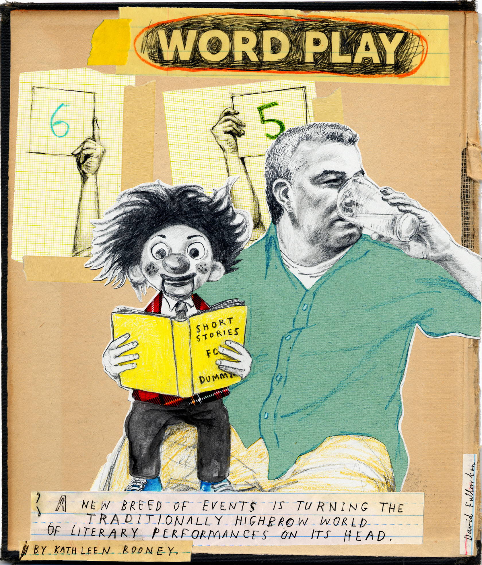
Here's a couple of the latest efforts. First up, for 'Go', the inflight magazine of AirTran, an illustration for an article about 'Literary Death Matches', which sound fascinating but are really just literary readings with some gimmicky showmanship added to make them slightly less tedious.
Next we have an illustration for an Alumni magazine published by Suffolk University in Boston. This one was for an article in which the author was bemoaning the fact that she had turned in a below par performance as a guest on Oprah's TV chat show. Knowing that she was feeling bad about messing up her 15 minutes of fame, her husband then did what any caring partner would do in those circumstances. He sent her a fake letter, supposedly from Oprah's production company, stating that she would not be welcome back on the Oprah Show because her performance had been so stilted. The author was not pleased.
Artwork for Young Offenders 12" vinyl.
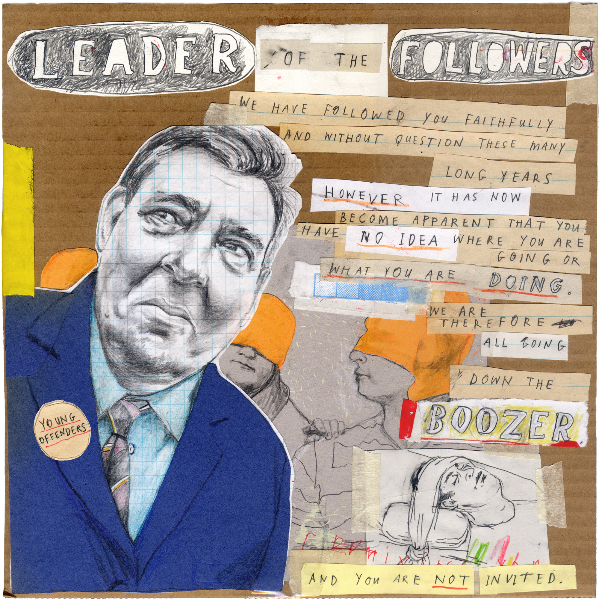 I was recently commissioned to do this 12" LP jacket art for San Francisco based 'punk rock sensations' The Young Offenders. Well, actually, my mate Tim is in the band and he asked me to do it in exchange for several flagons of foaming ale, which, I hasten to add, have yet to be forthcoming. Anyhow it turned out nice, so no hard feelings. In case you're wondering, The Young Offenders themselves are no one's idea of young, but they are adequately offensive– procuring a fine approximation of the late 70's British Punk Rock that I'm actually old enough to have experienced first hand. (For anyone who's easily impressed I still have my front row ticket stub for the Buzzcocks supported by Joy Division at the Edinburgh Odeon, 1979.) The album is available for download on iTunes or, preferably, as a limited edition 12" red vinyl from Deranged Records, complete with beautifully printed, full size, genuine cardboard album cover for a mere $10. The LP labels were hand drawn by yours truly as well, but you only get to see them if you buy the fucker*.
 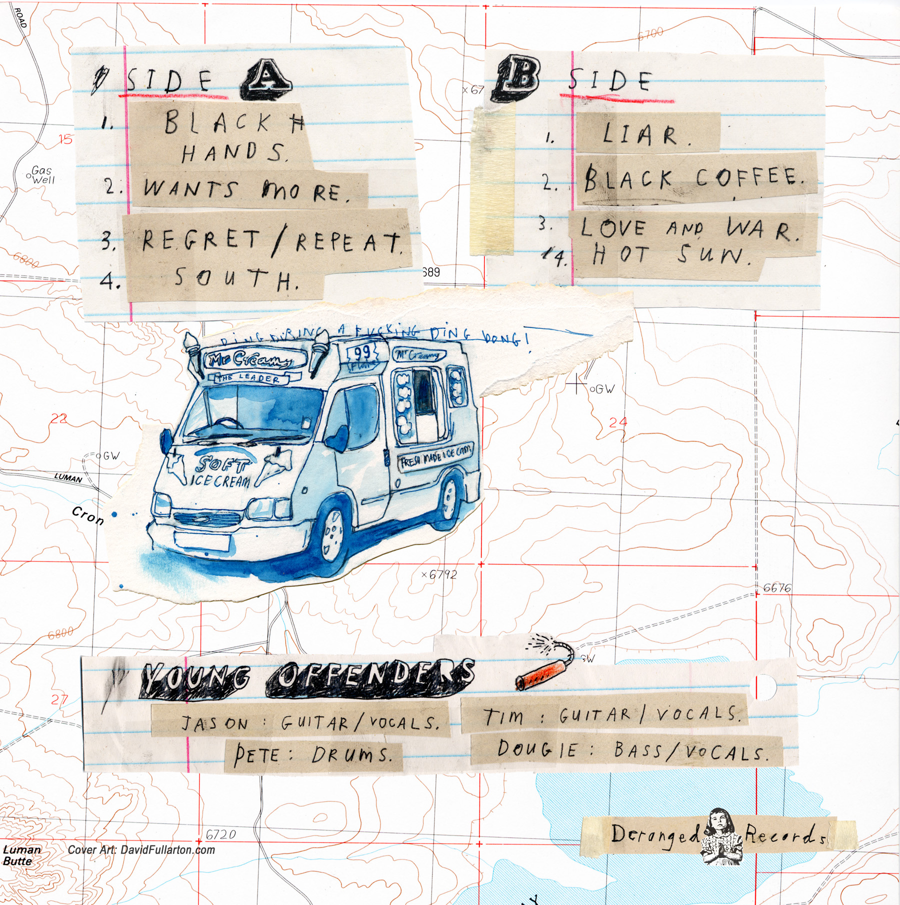 *This gratuitously offensive expletive has been included in a pathetically tame attempt to generate an atmosphere of 'Punk Rock' nihilism.
Illustration for the L.A. Times.
 I was recently commissioned by the LA Times to create an illustration for a review of Henry Roth's posthumously published novel 'An American Type'. It was an interesting experience - got the brief late on a Wednesday night with nothing but a cut & paste synopsis of the book from Amazon, and had to send rough pencils by the end of Thursday! My original idea featured different text, based on the idea of author Henry Roth being an American type himself, (the novel is largely autobiographical), so I was a bit bummed to have to change it and obscure that idea somewhat - but I'm still pleased with the way the end result looks. All in all it ended up being a pretty enjoyable assignment, don't think the novel is going to the top my reading list though.
CA Illustration Annual 2010.
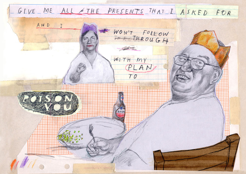 Bit late this one, but good news nonetheless, the 2010 Communication Arts Illustration Annual was published in May, and I'm delighted to say I managed to get the above illustration accepted into the 'Institutional' category. Apparently there were over 7000 entries so I'm pretty chuffed to get in. The winning entry is a Holiday card I created for Hang Art, the gallery that represents me in San Francisco. If you have your very own copy of the annual you can gaze upon my triumphant entry in all it's glory on page 176.I just received my very own 'Award of Excellence' certificate in the mail, complete with very shiny gold type, which I will not hesitate to use to impress people who are impressed by such things. They even spelled my name right. Hooray!
Flaming Lips, Timberlake and more name-dropping.
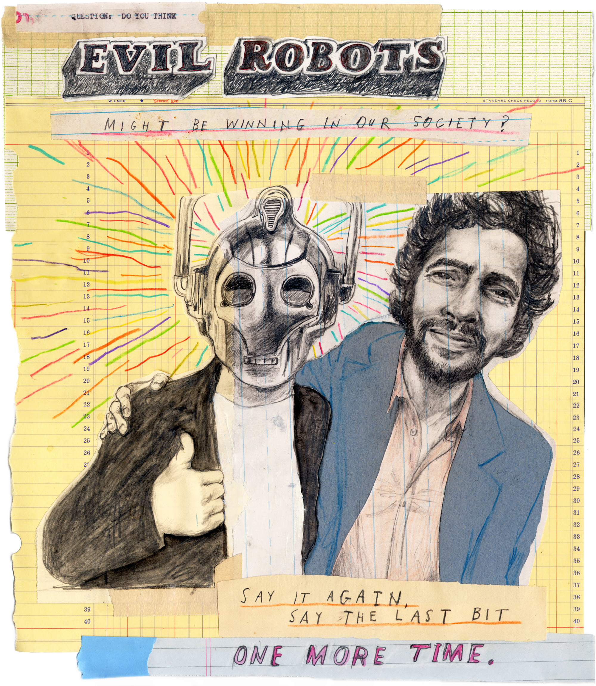 Bit of a strange one this.I was the lucky recipient of a feature on JustinTimberlake.com back in July of last year. Then just last month the delightful proprietors of the site got in touch and asked me to create an portrait of Wayne Coyne - the singer bloke from The Flaming Lips - and make a video of myself drawing it.It was an interesting experience, although I must admit there wasn't a lot in the interview to really get my teeth into when it came to coming up with an idea, which explains the Evil Robot quote. I liked Wayne Coyne's reaction to the question, which unfortunately ended up being deleted, so I'm not sure how much sense the whole thing makes now.Anyway the post is up now on the website as the visual component of an interview with the aforementioned Mr Coyne. It's a bit of a 'mash-up' with LA based artist SA Richard butting in every so often with his Big Painting. And to be honest it all seems a bit long to me.Here's the whole damn thing, regardless. Consider yourself warned.[youtube=http://www.youtube.com/watch?v=JL45VXIhILg&feature=player_embedded]
Official Merch.
 Late last year I was contacted by merchandising company BlueQ about using some of my artwork on one of their stainless steel water bottles. They chose the 'Unbeknownst to you I have been keeping score all along' piece that had appeared in my Sisyphus Office installation, and asked me to re-do it to fit the bottle shape.I have to admit it seemed like a peculiar thing to stick on a water bottle, but who am I to argue with a crack team of hip marketing experts. Maybe dehydrated stalkers and obsessives are a big target market. Anyway the BlueQ people were an absolute pleasure to deal with, and they just sent me a load of bottles, which look fantastic - even if I do say so myself.This remarkable receptacle is now for sale online and at pointless trinket stores everywhere. Not only do I get paid a tiny amount anytime someone's foolish enough to buy one, but 1% of the sale goes to support the conservation work of The Nature Conservancy. For those who care about such details, the bottle is 20oz./600ml, BPA free, no liner, 18/8 stainless steel and decorated with lead-free inks, all of which are good things, I'm sure. So all that remains is for you to buy one. Now. And yes, I will be keeping score.Cheers.
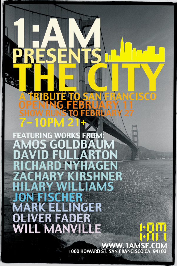
The City - Group Show.
I've got half a dozen or so new pieces in a group show at the First Amendment Gallery in San Francisco. The show is titled “The City” and is intended to be " a celebration of the city we live, work and play in. See San Francisco through the eyes of nine different artists as they represent their favorite elements of the city." I have to admit my contribution fails miserably when it comes to addressing that proposition, but hopefully no one will notice. And if they do, it's too bad, really, since there's no changing any of it now.
Things kick off on Thursday, February 11th with the opening reception at 1000 Howard, on the corner of 6th, from 7-10pm, and it's a 21+ event "with beats by DJ Don Kainoa and drinks by 1:AM bartenders" - I'm sure you get the picture. I hope to be there "chillin' with my bros", or something similar, so I encourage everyone to turn up and ply me with the aforementioned drinks. The show will run through February 27th.
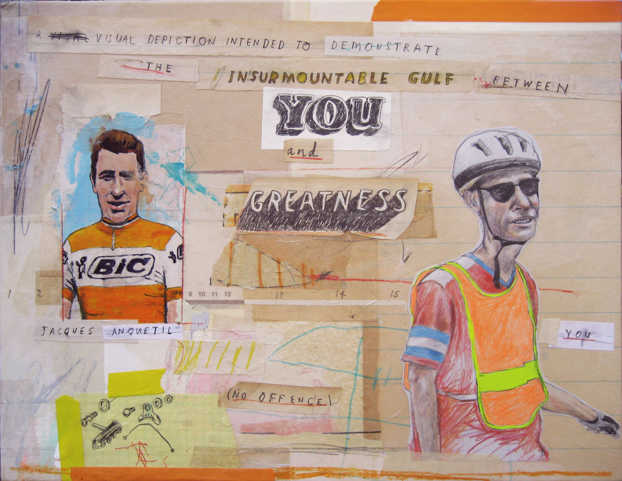
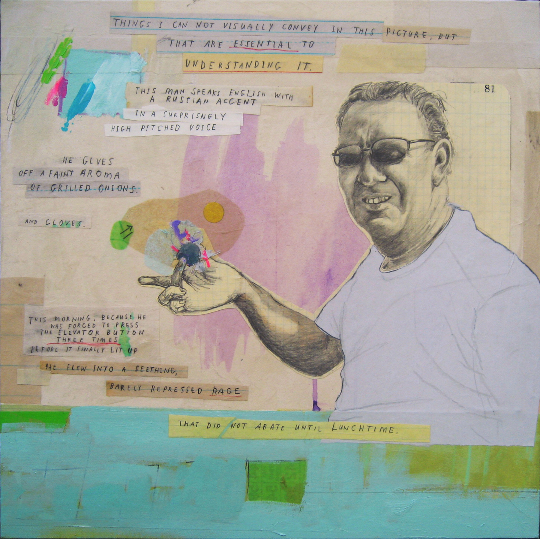
You can see most of the pieces I'm showing here. And I'll bung another couple of images down below, for those of you who can't bear to tear themselves away from these scintillating words.
"The Uphill Struggle", mixed media on canvas,14" x 18"
"Actions Speak Louder Than Words", mixed media on canvas, 18" x 18"
Apes, prints and tattoos.
Okay, so first up let me announce in a most self-promotional manner that I recently put a print of one of my pieces up for sale on Society 6. Never done it before, but it seemed pretty simple so I thought I'd give it a shot. I chose this attractive work featuring the twin joys of apes and gratuitous profanity - how can you go wrong with two things everyone loves!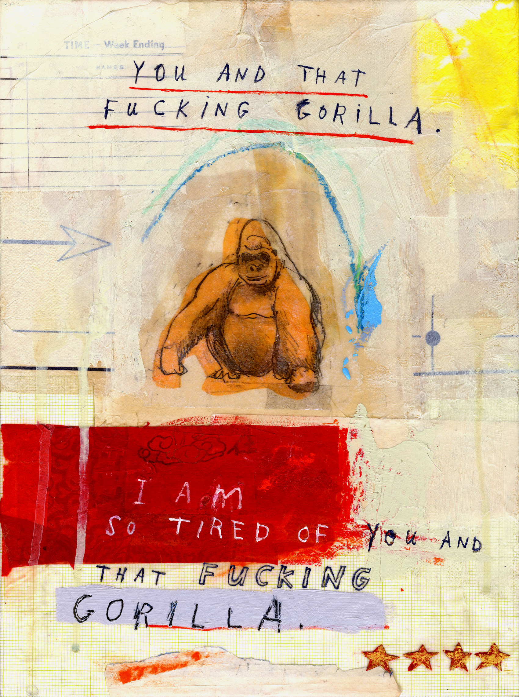 It sounds pretty fancy - gallery quality Giclée print on natural white, matte, ultra smooth, 100% cotton rag, acid and lignin free archival paper using Epson K3 archival inks, custom trimmed with 2" border - but I haven't actually seen a finished product, so if anyone out there actually gets one I'd love to hear what the quality is like. And, needless to say, if it's rubbish I'll deny all responsibility.Enough with the hard sell, let's move on to more entertaining matters. Over the past few weeks I've been contacted by a couple of people who have got themselves tattoos based on my work. I have to admit that this pretty much blows my mind, especially since one of them takes up virtually an entire limb. I have had one previous skin-based tribute, which by remarkable coincidence was an ape, tattooed on a bloke in Brazil. That particular tattoo can even be viewed during its painful creation on YouTube - you can almost smell the burning flesh. Anyhow, here they are in all their strange glory - together with the original work that inspired them. Ouch.
Busy.
Firstly let me apologize for the complete lack of recent updates. This is not, as you may suspect, because there's been nothing happening, but because I've been too damn busy. And I am also apparently incapable of doing more than one thing at a time. Multi-tasking? Not for me, my friends.First up - just did a big illustration job for Razorfish here in San Francisco. FEED is Razorfish’s annual study charting how technology is changing the way consumers engage with brands and I was the lucky bugger who was chosen to provide pictures (with words on them, of course) to illustrate the report's findings and provide a bit of humor. You can learn more about the report itself right here.And here are a couple of the illustrations from the report.
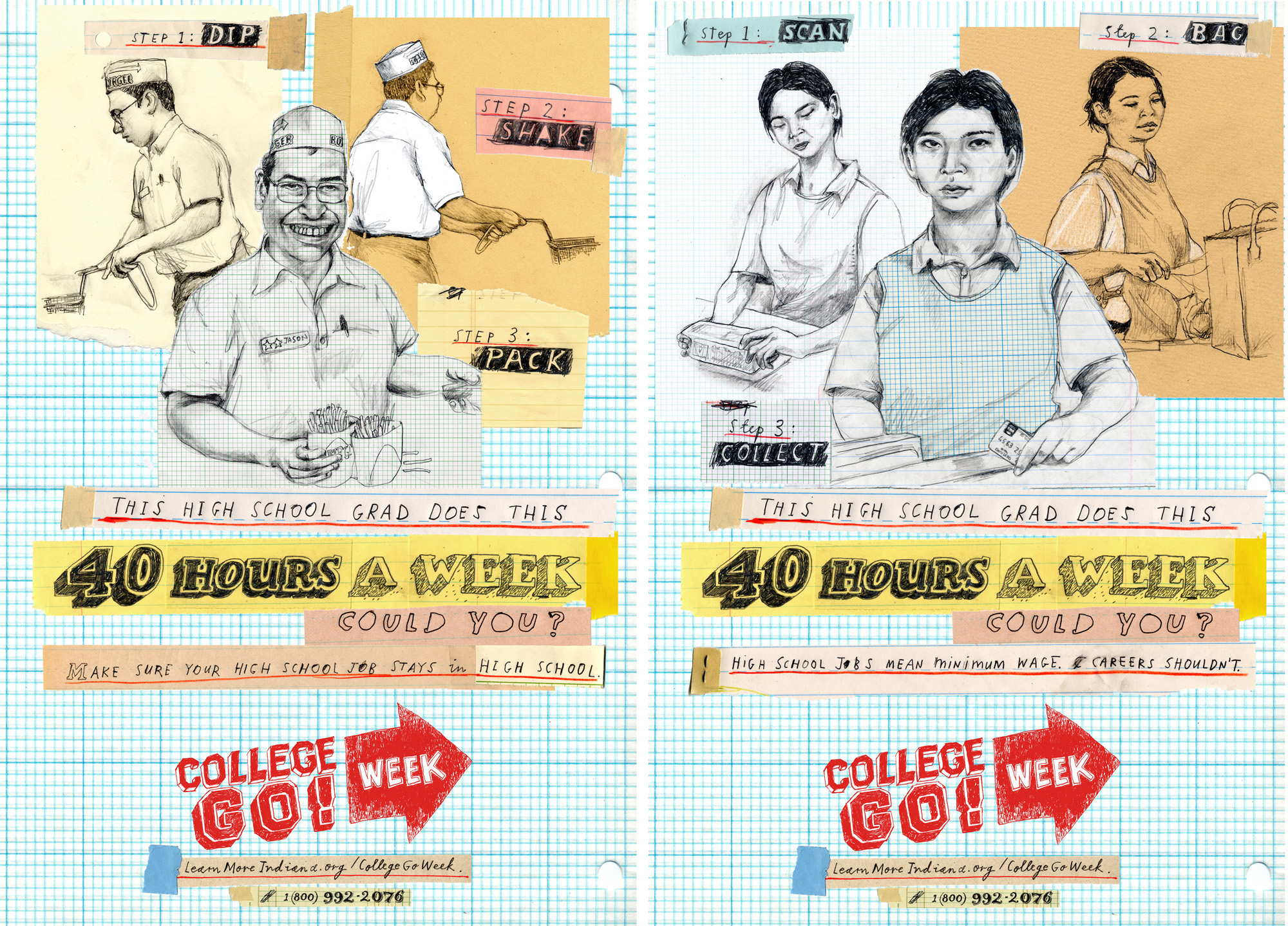
Right before the Razorfish job I was working on another illustration assignment, this time for ad agency Publicis Indianapolis and their client Learn More Indiana. This involved designing, illustrating and hand lettering a campaign of posters aimed at High School students who are about to graduate in an attempt to persuade them to continue their education. Publicis supplied me with the copy and I put the whole thing together working with one of the agency's Art Directors. Here are a pair of examples of what the end result looked like:
Lotsl more examples of the work I did for both of these projects can be seen right here.
Contemporary Arts Museum, Houston.
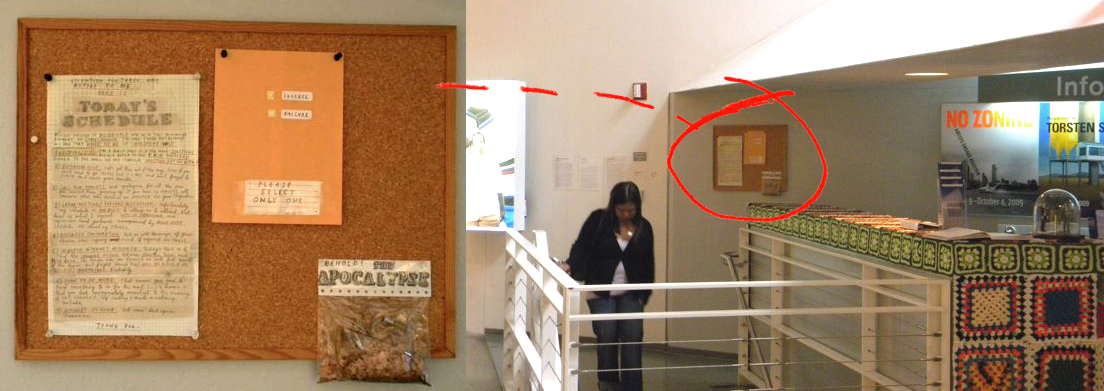 As threatened, the Sisyphus Office exhibit has moved to the Contemporary Arts Museum in Houston where it will run until the end of September. The museum has tried to remain true to the original concept of having the work live in an office environment rather than just hung in a gallery, which explains why it's hidden away in various obscure locations (that's their story anyway).There's a Sisyphus Office table that greets visitors when they come in. It provides visitors with a Sisyphus Office file, complete with an explanation of the whole idea and a map that guides them around the Museum to wherever the pieces have been integrated (often in places visitors normally never tread). Visitors then stamp their file in a beautiful bureaucratic way and head off in search of the works.Sadly there is absolutely no mention of the whole thing on the CAMH website, so I only have the organizer's word and the above crappy photo to prove this isn't just a figment of my imagination. If anyone reading this does visit the show and manages to snap any pics, I'd love to have them.
Book of the Week on Blurb.
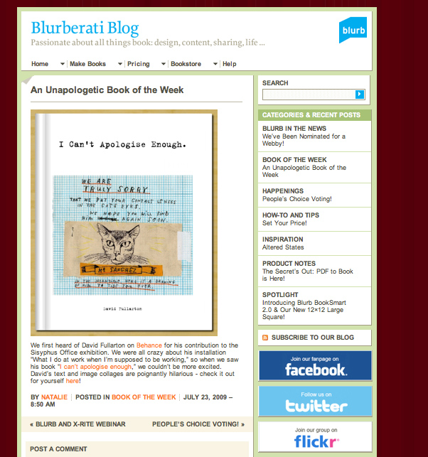 Those lovely people over at Blurb have bestowed this illustrious honor upon the book I hastily slapped together, I mean painstakingly designed, last year. This couldn't really come at a better time since while I was watching the telly last night about 50% of the electrics in our house suddenly imploded and left us sitting, entertainment-less, in darkness. Hopefully the resulting enormous spike in sales of this "poignantly hilarious" volume will help me pay for an electrician, and I cease my pathetic attempts to entertain the kiddies with puppet shows by candlelight.If you'd care to buy one and help my children avoid the disturbing spectacle of me talking in a high-pitched voice and wielding glove puppets you can click right here. Or if you prefer to click on something more visually stimulating there's a natty little link off to the right hand side and down a ways.By the way, if you take my advice you'll buy the Hardback version. The paperback's cover has a disappointing habit of curling up like a week-old cheese sandwich after just one read. (Please note: this has absolutely nothing to do with me getting more money for the hardback - obviously.)
Blogapolooza!
 I've been having a blogtastic time lately. Over the last few weeks the Bloggerati have been blogging my work and even blogging each others blogs about my work. It's all been bloggeriffic. I just want to express my humble appreciation for all this undeserved attention and the kind words and comments that have been posted in all quarters of the World Wide Internets. It's tremendously encouraging and I really appreciate it, so thank you all.In other news... the Sisyphus Office installation keeps on rolling! Yes the show might be down, but it's not over yet. Amazingly the Contemporary Art Museum in Houston seems to have decided to reconstruct some version of my haphazard exhibit within their hallowed halls. Details are a little unclear right now, but stay tuned for more.
Sisyphus Office Tour.
Sisyphus Office curator, top artist and all-round good egg, Jonn Herschend leads a bus-load of bemused art lovers around my installation "What I do at work when I'm supposed to be working", which is scattered around the offices of Radio Station 90.1 KPFT in Houston, Texas. [vodpod id=ExternalVideo.841249&w=425&h=350&fv=]
Sisyphus Office - a group show in Houston, TX.
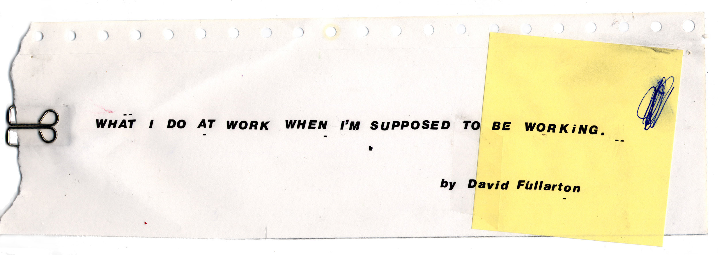 Sisyphus Office is an exhibition organized by San Francisco based artist, curator, and co-founder of The Thing Quarterly, Jonn Herschend and based out of Skydive, a Houston, Texas gallery.
The artists involved in the project are collaborating with businesses and offices in and around Houston in order to highlight art as an integral and necessary distraction in our day to day life. The artists and offices involved in Sisyphus Office are working physically and conceptually with the notions of existentialism, capitalism, artistic romanticism and deadpan slapstickism as a means to examine the artifice that keeps us clinging to reality and distracted from the void. Sisyphus Office is about punching the clock, and then punching it again…but harder the second time. It’s about transcending the mundane through the beauty and absurdity of distraction. It’s about recognizing the comedy in the tragedy of the day to day… and then waking up again to do the same thing all over again the next morning.
My somewhat hastily assembled contribution to this group show is a so-called "installation" in the offices of Houston radio station 90.1 KPFT. It's entitled What I do at work when I'm supposed to be working. and it consists of a bunch of small, abject text-based artworks made entirely from office supplies. These are pinned up randomly around the shabby looking office, hopefully to be stumbled upon in amongst all the existing notices, flyers and memos that were plastered all over the walls and noticeboards. More details here: http://www.theskydive.org/ 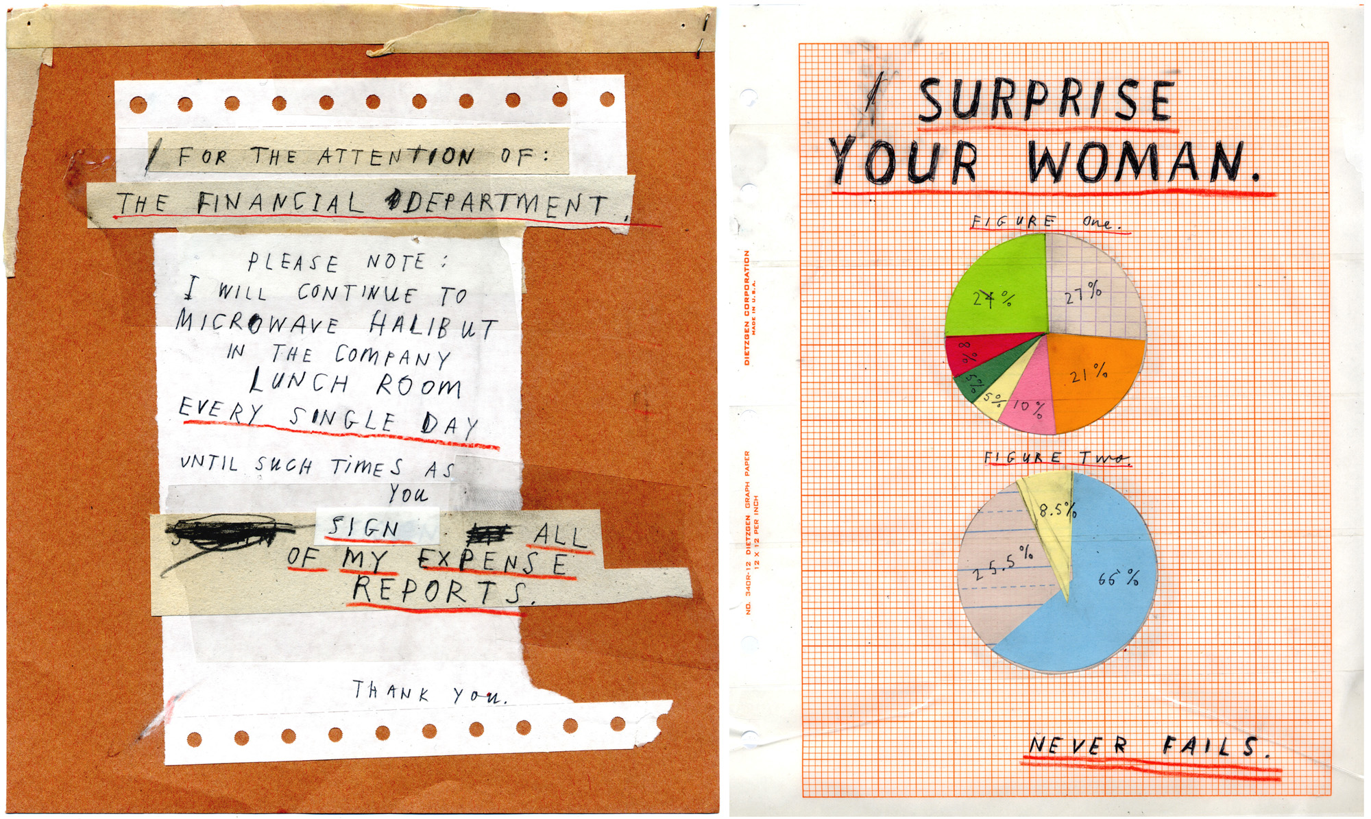
Boooooooom!
Solo show photos.
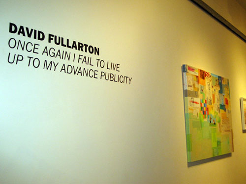
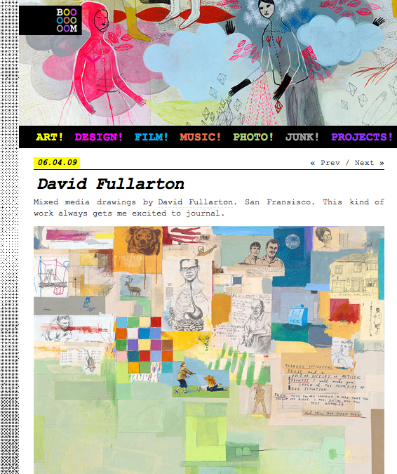
Here's a link to a little feature that appeared on the Doodlers Anonymous site with some nice shots of the opening night of my recent solo show. They were taken by Rachel, the sister of the mysteriously named Okat - the man behind DA. She came a long way to take the photos and check out the exhibition. Thanks Rachel.