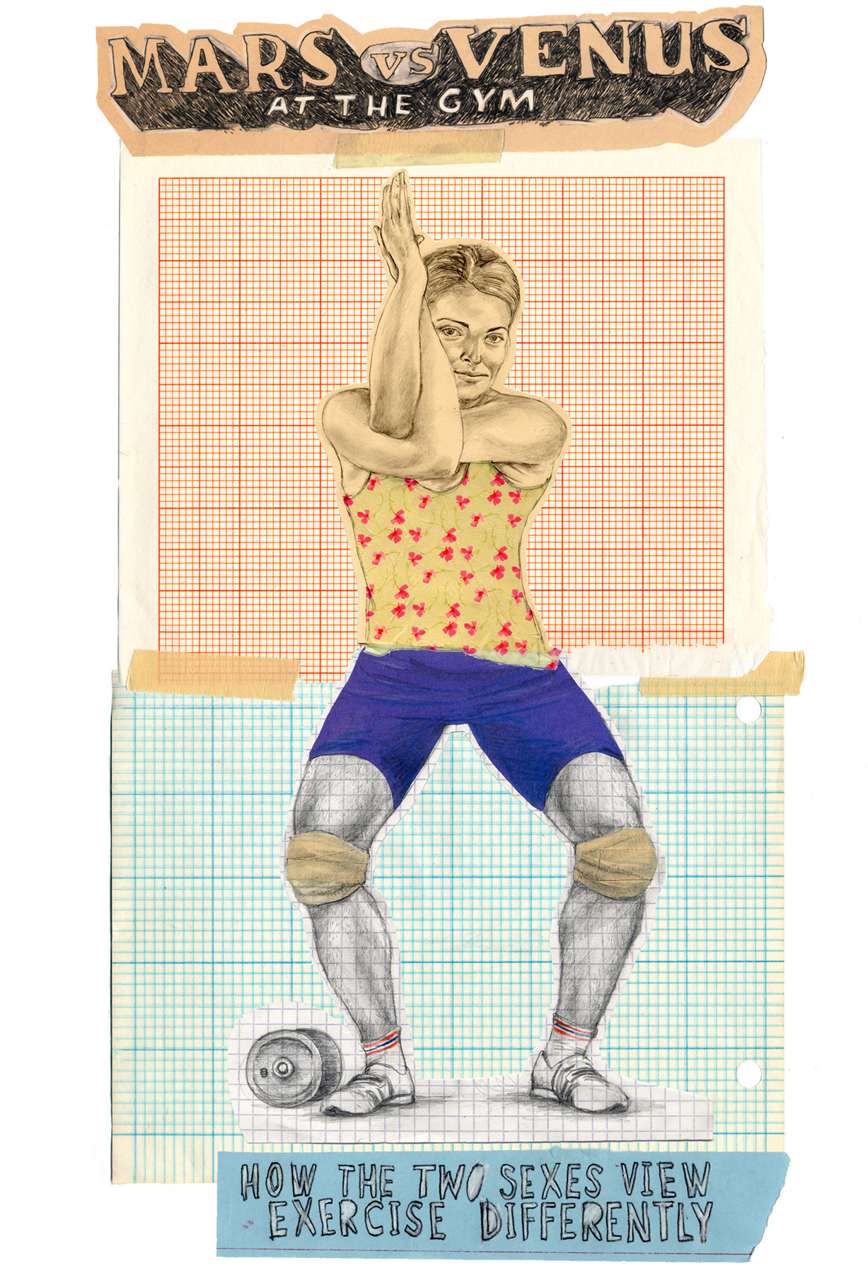
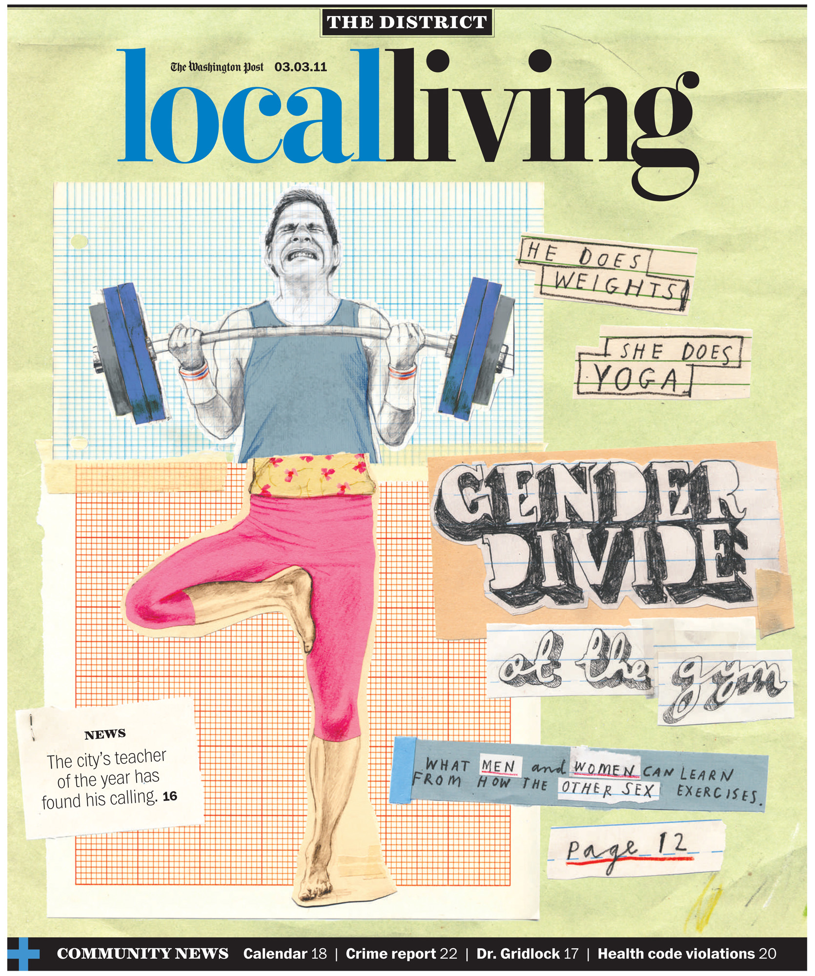
Two posts in two days! Well, don't say I didn't warn you. The last 48 hours has seen a virtual torrent of online activity unleashed. I've even been tweeting and I uploaded a whole butt-load of last year's drawings and paintings to my Behance page. Soon you'll look back longingly on the days when I would go for weeks, nay months, without a digital utterance.Anyhow, the purpose of this particular rambling update is to vaingloriously brag about a recent illustration commission for the Washington Post. The cover of the Local Living section no less.
The article I was asked to illustrate was about the big differences in the way that men and women exercise - men going berserk lifting weights, generally overdoing it and injuring themselves, and women doing stuff like yoga and pilates and taking it too easy to actually get much benefit. As well as the cover there was an inside illustration that appeared alongside the article. I thought the humor would come from contrasting the two approaches side by side - so my challenge was to work out a way to do that in both pieces, and tie them together as well. The result was this approach, kind of based on an exquisite corpse drawing, where the picture of the man and the picture of the woman were 'torn' in half and reassembled as one figure, comparing the characteristics of both to comic effect.

As you can no doubt tell I was responsible for hand drawing most of the type too. It was quite a work out.
